
A single half-hourly meter produces 48 readings a day - one every thirty minutes, every day of the year. That's over 17,500 numbers annually, from one meter, on one site. Most businesses see them only as a total on an invoice. (And soon, every business will have them - half-hourly settlement is being rolled out across the market, not just to large sites.)
Looked at properly, that data is closer to a fingerprint than a bill. It shows how a site actually operates - not how someone assumes it operates, not how the original design brief said it should operate, but what's genuinely happening, half hour by half hour, all year round.
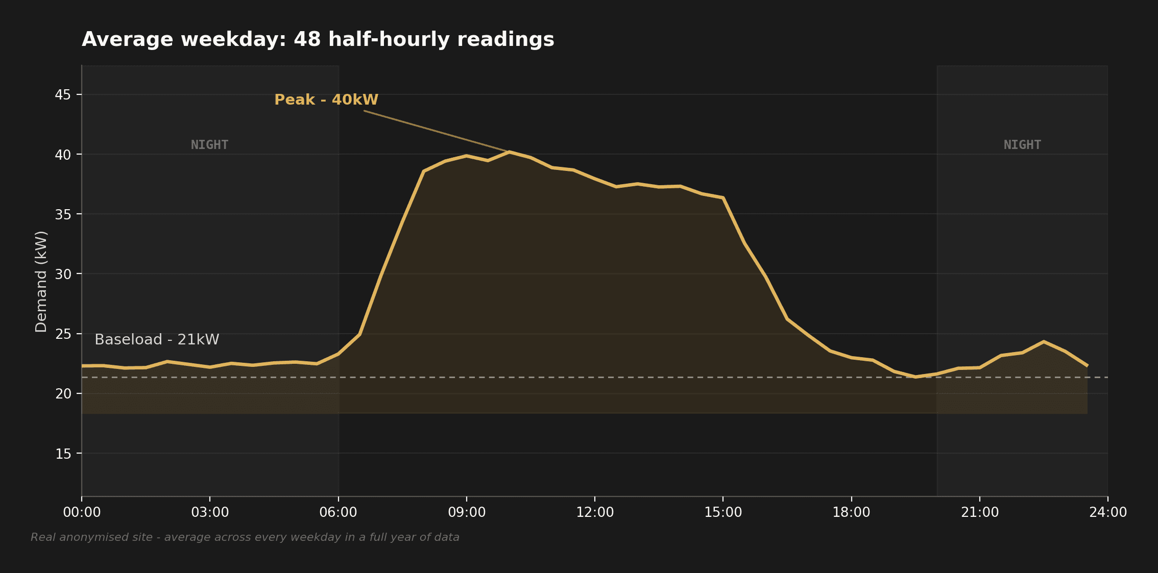
Here's a real example - one real, anonymised site, shared with permission, no name or identifying detail attached. This is its average weekday, every half hour, averaged across a full year of readings: a 21kW baseload, ramping up to a 40kW plateau that holds through the working day, back down to baseload by early evening:
Every one of the eight questions below is really just a different way of interrogating that same shape.
- BaseloadThe floor, not the averageWhat the site pays for permanently, whether anyone's using it or not
- PeaksHow high, and what starts togetherAgreed capacity and network charges both respond to this
- NightsOvernight demand vs genuine overnight needThe gap is either resilience-relevant, or straightforwardly wasted spend
- WeekendsSaturday vs Tuesday, like for likeReveals whether weekend demand is intentional or just never switched off
- SolarDemand shape vs a typical generation profileDecides how much generation the site could actually use as it's produced
- BatteryWhere demand and cheap power genuinely don't line upConfirms whether there's a real, repeating mismatch worth paying to solve
- ProcurementShape as well as volumeTwo sites with identical annual kWh can need very different contracts
- BillsMeter readings vs what was actually invoicedThe only reliable check that the bill matches what was really used
Here's what's usually hiding behind each one.
Baseload: what never turns off
Every site has a baseload - the level of demand that persists even in the quietest half hour of the quietest day. It's whatever keeps running regardless of occupancy: server rooms, refrigeration, standby equipment, security systems, building management plant.
In the shape above, that's the 21kW floor running flat from early evening to 6am. The evidence is simple to read: plot every half-hourly reading across a year and look at the floor, not the average. What sits there is telling you what the site pays for permanently, whether anyone's using it or not.
Commercially, baseload is often the most overlooked cost on site. Nobody schedules a meeting about it, because nothing seems to be "on." But a baseload meaningfully higher than the site's genuine quiet-hours needs is a real, recurring cost - not a one-off inefficiency, a permanent one, every day, every year, whether the business is busy or not.
Peaks: what starts together, and why
The other extreme matters just as much. Peak periods usually aren't random - they track the working day: equipment, occupancy and process load all switching on within the same couple of hours each morning, and off again within a similarly narrow window each evening.
That's what the daytime plateau in the chart above is showing - demand roughly doubles within two hours of the site opening up, holds close to its highest through the whole working day, then steps back down as the day ends. The evidence shows not just how high the peak is, but how it forms and how long it holds - a short, sharp ramp followed by a long plateau is a different problem to a single brief spike, even if the peak kW figure looks the same.
Commercially, this matters for two separate reasons: agreed capacity - get it wrong and you're either paying for headroom you never use, or exposed to breach charges - and network charges that respond specifically to when demand happens, not just how much. A peak that could be staggered by twenty minutes, at no operational cost, can be a real saving with no capital spend at all.
Nights: what happens when everyone goes home
Overnight demand tells its own story. On an unoccupied site, what's still running is either intentional - cold stores, servers, security, certain agricultural or process loads - or it's waste, equipment left on that nobody's actively deciding to run.
The evidence is a direct comparison: overnight demand against what the site's own operations genuinely require overnight. Where those two numbers diverge, that gap is either resilience-relevant - it matters for outage planning - or it's straightforwardly wasted spend.
Weekends: is Saturday really the same as Tuesday?
Not every site should have the same demand shape on a Saturday as a Tuesday - but plenty do, by accident rather than design. The evidence here is a simple like-for-like comparison across the week - same site, two different days:
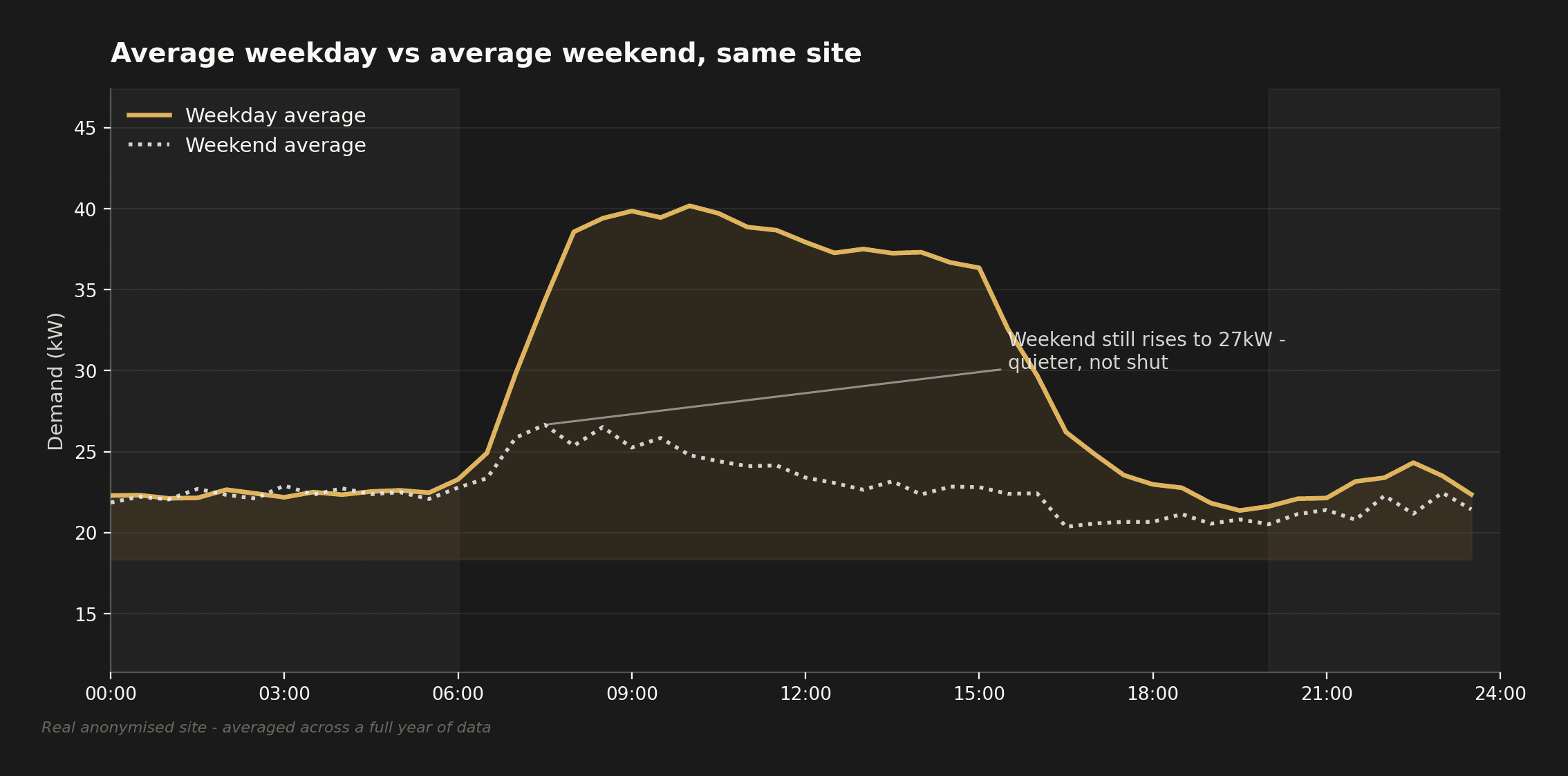
This site isn't shut at weekends - demand still rises, just to 27kW instead of 40kW. That's the more common real-world answer, and arguably the more useful one: not a clean "on or off," but a genuine, worth-asking question - is that weekend activity deliberate (a real, smaller weekend operation) or is it equipment nobody's specifically responsible for switching off on a Saturday? Small, unglamorous answers, but they add up over a year.
The shape above also matters well beyond the weekend itself - it's the same evidence the Solar and Battery sections below actually run on.
Solar: could this site actually use it well?
Before spending a penny on a feasibility study, half-hourly data already contains most of the answer to "would solar work here?" Overlaying a site's own demand shape against a typical solar generation profile shows how much of that generation the site could genuinely use as it's produced, rather than exporting it at a lower rate.
A site with strong daytime, weekday-heavy demand is a different proposition to a site that's largely quiet during daylight hours and busiest at night. The generation might be identical on both roofs; the commercial case is not.
Battery: is there a real mismatch to solve?
The same overlay that answers the solar question tells you something about batteries too, but the question is different: is there a real, repeating mismatch between when demand happens and when either solar generation or advantageous import pricing is available - big enough, and consistent enough, to justify storage?
Sometimes the evidence says yes clearly. Sometimes it says the mismatch exists but is too small or too irregular to justify the capital. Both are useful, defensible answers - and knowing which one applies before committing capital is the entire point of looking at the data properly in the first place.
Procurement: shape matters as much as volume
Most procurement conversations start and end with annual volume. Half-hourly data adds shape: how much of that volume sits in expensive time bands, how demand moves month to month, and how consistent consumption actually is.
The same real site, viewed by month instead of by half hour, tells its own story:
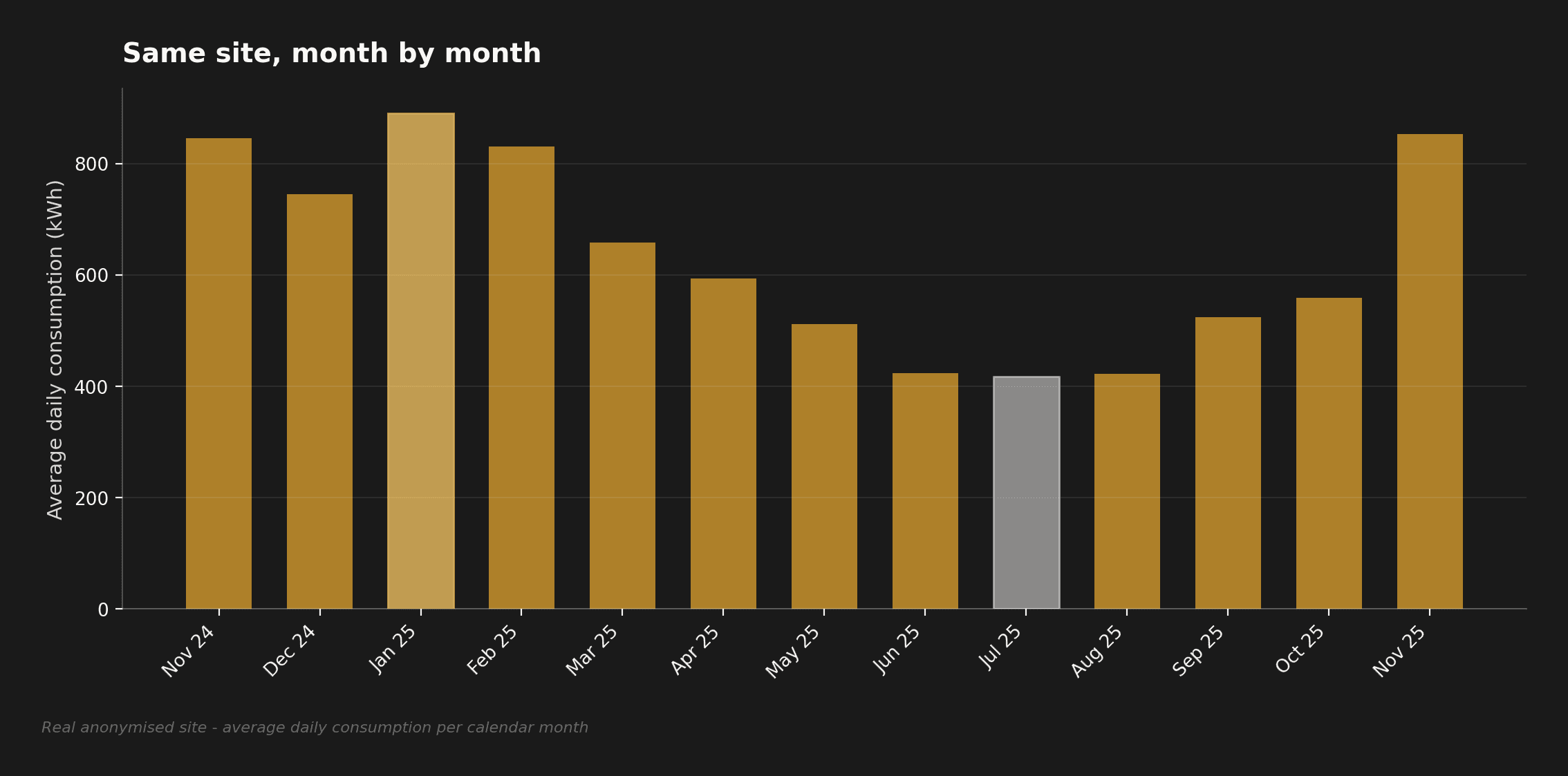
More than double the daily consumption in January than in July - on the same site, same equipment. Two sites with identical annual consumption can have very different procurement needs once shape like this is understood, both across the day and across the year - and a contract priced only against the total, not the shape, is being priced on incomplete information.
Bills: are the invoices even right?
Finally, half-hourly data is the most reliable check against the bill itself. Estimated reads, incorrect meter multipliers, wrong tariff bands and misapplied charges all show up as inconsistencies between what the meter actually recorded and what the invoice says was billed.
This isn't a dramatic finding on most sites. But on some, it's a very real one - and it's only visible if someone actually compares the two.
Where to start asking better questions
Half-hourly data rarely hands you a finished answer. What it does is tell you where to look next - which of these questions is actually worth pursuing on a specific site, and which ones can be safely set aside.
Most businesses are already sitting on a year of this data, unread. Nothing above was missing. It just hadn't been looked at.
What's next in this series
Every chart above is a real, anonymised site, shared with kind permission - no name, no identifying detail. That's the starting point for a short series: looking at what we actually found in different real sites' half-hourly data, what shape each one turned out to have, and what that meant for sizing solar, sizing a battery, or choosing a tariff. First up: a factory, a school, and a smaller site with a very different consumption profile to both. More to follow here as each one's ready.
Sources and further reading
- Elexon - Market-wide Half-Hourly Settlement and the BSC
- Related: Every Meter Is Becoming Half-Hourly
Somerford reviews half-hourly data as a matter of course on every engagement - not as a compliance exercise, but because it's usually the fastest way to separate real opportunities from assumptions. If you've got a year of HH data sitting in a portal nobody's looked at properly, get in touch.